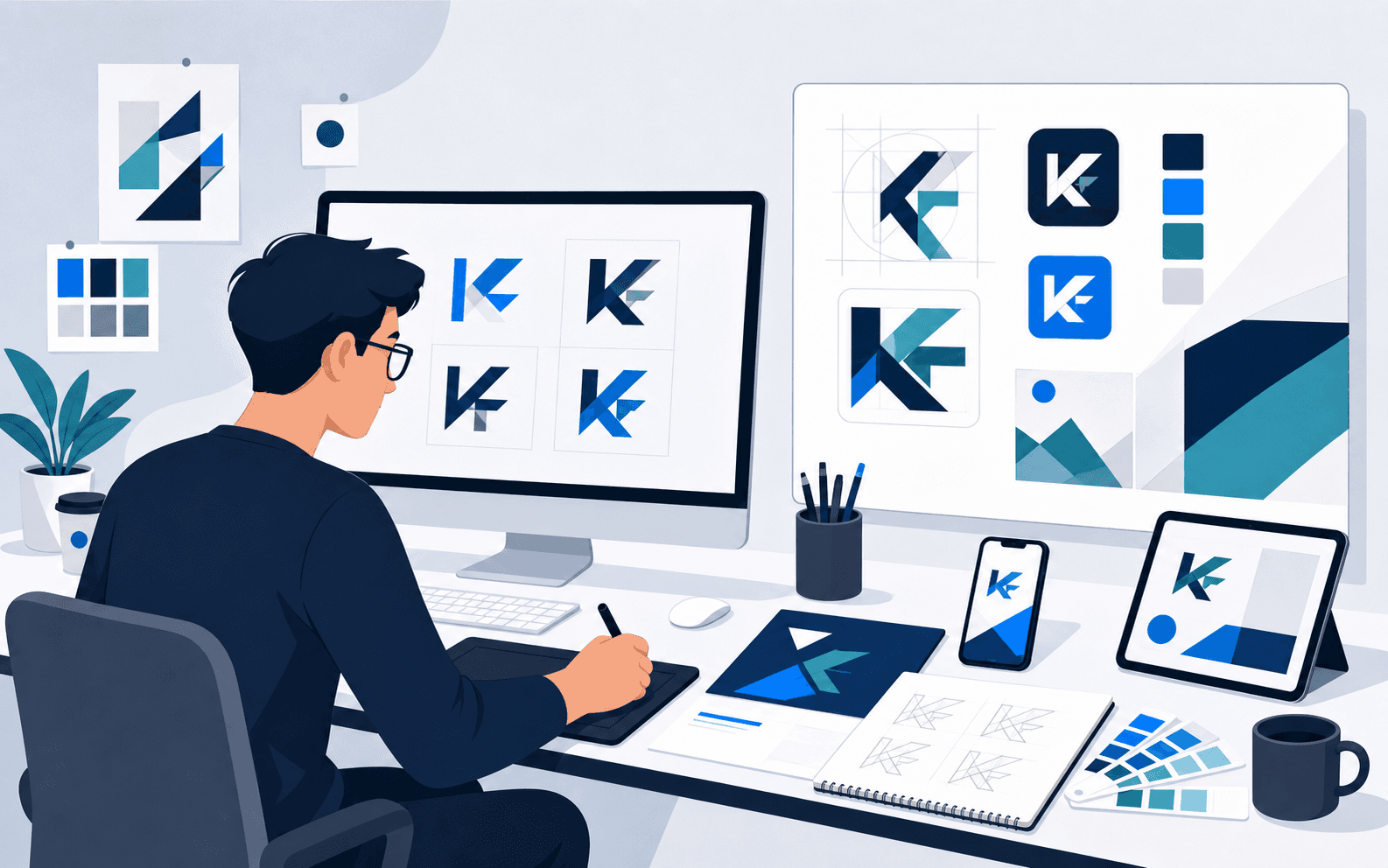
Overview
The KF engagement focused on establishing a recognisable visual starting point for the brand. iEncode Tech began with brand discovery to understand how the identity needed to be perceived, then moved through multiple logo concept explorations before selecting a coherent visual direction. Presentation and refinement centred on proportion and clarity rather than added decorative detail, since a mark only earns its keep once it works on a small screen, on signage, or on a printed document, not just in an idealised mockup. The result gives KF a mark it can use with confidence: a considered starting point rather than a decorative sketch chosen on style alone.
Key Features
- Brand discovery to understand how the identity needed to be perceived
- Multiple logo concept explorations
- Selection of a coherent visual direction
- Presentation and refinement focused on proportion and clarity
- Preparation of the identity for adaptable, consistent application
A practical identity
A useful logo must remain legible and recognisable in the contexts where it will actually appear, on a small screen, on signage, on a printed document, not only in an idealised presentation mockup. The design process considered clarity and consistent presentation rather than adding decorative complexity for its own sake, treating restraint as a design strength rather than a limitation.
Challenges & Solutions
Small-scope identity engagements still have to solve real design problems: a mark that looks distinctive in a large presentation file can fail completely once reduced to a favicon or embroidered onto a uniform. iEncode Tech addressed this by testing concepts against practical use cases throughout development, not only at final sign-off, and by refining the selected direction specifically for legibility and adaptability rather than continuing to add visual detail.
Technologies Used
Adobe Photoshopsupported detailed concept rendering and refinement, giving the design team precise control over proportion, spacing, and presentation as logo concepts were developed and tightened.Figmasupported collaborative design work and presentation, making it straightforward to share concepts, gather feedback, and iterate on the selected direction in a shared, accessible workspace.
This was a visual-design engagement rather than a software build, so no application technology stack applies beyond the design tooling above.
Results & Impact
Only the logo and supporting visual-identity scope have been supplied, so this page does not claim a larger guidelines system, specific colour rationale, or collateral suite that has not been provided. What KF received is a clear, adaptable visual starting point: a professional mark developed through a considered process rather than a quick decorative exercise, giving the brand a legitimate identity to build on.