Overview
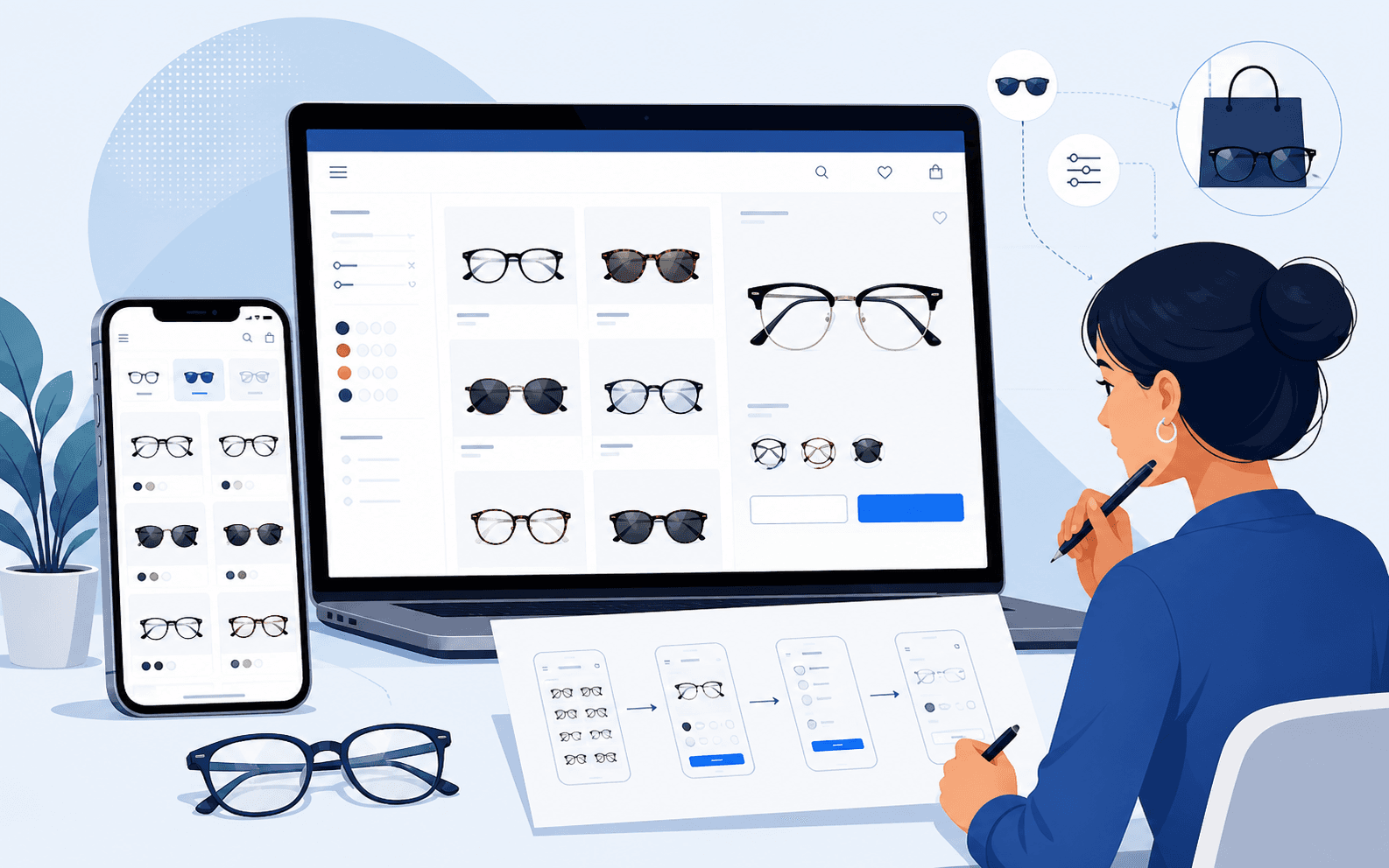
Customers browsing eyewear make heavily visual comparisons, judging frame shape, colour, and proportion against their own face before they read a single product specification. Dense layouts or unclear product hierarchy interfere with that process directly, particularly on a phone, where fewer items are visible at once and every extra tap costs attention. Octa Frames needed its spectacles and sunglasses catalogue to stay the clear focus of the experience while navigation and commerce actions remained easy to find and use. iEncode Tech delivered the product-focused UI/UX, the catalogue experience, and a complete WordPress e-commerce build hosted on AWS. The case worth telling here is less about any single screen and more about the discipline of keeping product imagery the priority through every layout decision that followed.
Where the catalogue started
Eyewear e-commerce sits in a specific spot within the wider e-commerce landscape: the product itself is highly visual, but the purchase decision depends on comparison, judging one frame's shape and proportion against another's, more than it depends on reading specifications. A catalogue built without that comparison behaviour in mind tends to default to one of two failure modes: dense grids that prioritise volume over clarity, or spacious layouts that make comparing more than a couple of items at once genuinely slow. Octa Frames needed a storefront the business could manage independently, on a foundation the team could update themselves, while still avoiding both of those failure modes.
The core challenge
A visually driven catalogue like eyewear puts specific pressure on interface design that generic e-commerce templates do not account for:
- Product imagery needed appropriate prominence without the rest of the interface, navigation, filters, and actions, competing for the same visual attention
- Responsive behaviour needed to feel deliberately designed for smaller screens, not like a desktop catalogue simply compressed to fit
- Customers needed to retain useful product context while comparing items, rather than losing their place each time they moved between browsing and detail views
- Shopping actions had to stay easy to locate at every breakpoint, so browsing and purchasing never felt like separate modes of the same product
- The scope of the engagement had to be represented accurately, without implying features such as virtual try-on that were not part of the confirmed delivery
Discovery and setting the design goals
Discovery focused on how a customer actually shops for eyewear online: scanning many options quickly, narrowing to a handful of favourites, then comparing those favourites closely before deciding. That behaviour set the goals for the catalogue directly: spacing and image prominence needed to support quick scanning without sacrificing the detail needed for close comparison, and moving between a catalogue view and a product page needed to feel like a natural continuation of browsing rather than a context switch that made a customer lose their place.
Solutions
iEncode Tech developed the catalogue structure, spacing, visual hierarchy, and product pathways as one connected system rather than designing pages in isolation. Image presentation was kept consistent across the catalogue so customers could compare frames confidently, and layout decisions favoured scannability, letting a customer take in several options quickly, over dense grids that packed in more products at the cost of clarity.
Responsive behaviour was designed breakpoint by breakpoint rather than derived automatically from the desktop layout, preserving useful product context, key details, pricing, and imagery, on smaller screens instead of hiding it behind extra taps. Navigation and shopping actions were kept consistent and easy to locate throughout, so customers could move between discovery and product detail without relearning the interface at each step.
Designing for visual comparison
The interface treats spacing as a functional decision, not a decorative one: enough room around each product for its shape and colour to read clearly, without so much room that a customer can only compare two items at a time before scrolling. Category and filter navigation were kept close to the product grid rather than tucked away, since narrowing a catalogue by frame shape or style is a core part of how eyewear shoppers actually decide, not an optional refinement. On mobile specifically, layouts were built from the smaller screen upward rather than adapted downward from desktop, which is why product context stays visible even as the available space shrinks.
Building the platform
Catalogue and visual merchandising
A unified catalogue system covers structure, spacing, and visual hierarchy as one connected design decision, keeping spectacles and sunglasses the clear focus of every browsing screen.
Product comparison experience
Consistent image presentation across the catalogue supports confident visual comparison, letting customers judge frame shape, colour, and proportion without the layout working against them.
Responsive interface
Layouts were purpose-built for smaller screens rather than compressed from a desktop design, preserving key product details and imagery at every breakpoint.
Commerce workflow
Complete e-commerce functionality, from discovery through checkout, was implemented on WordPress, giving Octa Frames a storefront the business can manage without depending on engineering support for routine catalogue and content updates.
Technology and architecture
- Platform: WordPress powers the storefront, chosen for a content-management foundation that lets the Octa Frames team update the catalogue, imagery, and product copy independently, while still supporting a fully custom, product-focused design rather than a generic template.
- Infrastructure: AWS (EC2, Lambda, S3, Route 53) hosts the site and its assets, giving the storefront reliable uptime, scalable image delivery for a highly visual catalogue, and managed DNS.
No virtual try-on or other unconfirmed feature is claimed here; this case study describes only the delivered WordPress e-commerce build and its AWS infrastructure.
Where the build got hard
The genuine difficulty in this project was balancing two goals that pull against each other: giving product imagery enough room to support real comparison, and keeping enough products visible per screen that browsing does not feel slow. Getting that balance wrong in either direction produces a catalogue that looks fine in isolation but performs poorly once a customer is actually trying to shortlist a handful of frames from a larger range. Tuning image size, spacing, and grid density specifically for eyewear, rather than reusing a generic e-commerce template's defaults, is what resolved that tension.
Responsive behaviour carried a related but distinct challenge: a desktop catalogue that simply shrinks to fit a phone screen tends to hide exactly the product context, price, key details, a customer needs while comparing on the smaller device they are most likely using. Designing mobile layouts as their own breakpoint-specific decisions, rather than a scaled-down version of desktop, addressed that directly.
Results and impact
iEncode Tech delivered the product-focused UI/UX, catalogue experience, e-commerce functionality, and complete responsive website implementation on a WordPress and AWS foundation, giving Octa Frames a storefront that is both easy for the business to maintain and built specifically around how customers actually shop for eyewear: visually, comparatively, and across whatever device they happen to be using.
What this project reinforced
Visual-merchandising decisions, spacing, image prominence, comparison flow, deserve the same design rigour as any functional feature, because for a category like eyewear, the browsing experience effectively is the product page. That principle carries directly into other UI/UX design and e-commerce engagements, including the three-sided marketplace design behind SewaMart.
Selling a visually driven product where comparison matters as much as conversion? Talk to iEncode Tech about a catalogue built around how customers actually browse, or see the Octa Frames project overview for a portfolio-style summary of the build.